Golden ratio… Say what now?

Did you know that everything that is designed by nature, that appears in front of your eyes, like the wings of a butterfly, the core of a sunflower, the growth of trees or the eyes of a fly can be understood by math? Did you know that this math can be used as a way of designing beautiful and effective pieces every time?

Ok… What is that math? Well, around 1202, a mathematician named Leonardo Fibonacci found out a sequence that worked for the progressive growth of things found in the nature. He started by watching how rabbits were conceived and started taking notes of that. He saw that one rabbit couple gave birth to another one, after that, the two pairs of rabbits, gave birth to one pair and the other, to 2 pairs and so on. Doing this, we have the sequence based on adding one number with the next one: 0, 1, 1, 2, 3, 5, 8, 13, etc…

The sequence is not the point. The purpose of this is its usage.

With a division in a rectangle that gives us a ratio of 1 : 1.618 the pieces can be designed in proportion and everything will look nice. It is used in architecture, advertising, product design and many other fields. Here are some examples that can prove that it works.

das-design-des-apple-logos-700x500-700
Apple logo design with golden ratio – http://www.designyoutrust.com

download
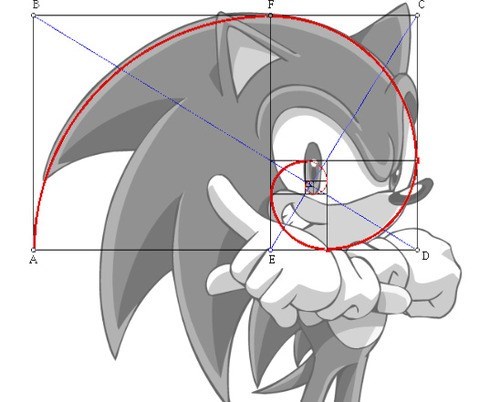
Sonic the hedgehog – SEGA – http://www.cheezburger.com

panthenon
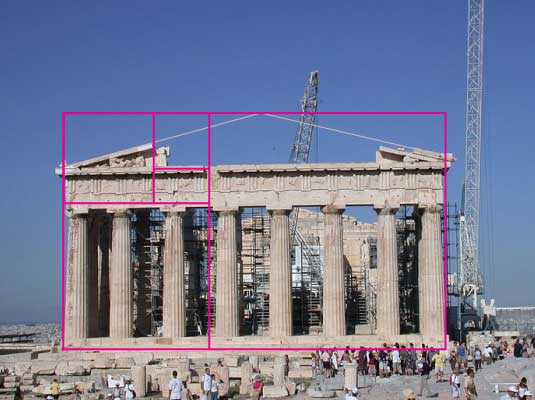
The Parthenon – http://www.creaivebloq.com

The best way to study this? A good design principles book, a good gestalt book and lots of math classes!

See ya!

Standard

Bon design bad design

When we find ourselves studying about design, often people ask us if some said design is good or not… The short answers would be yes or no. But in general I like to think that there is no such thing as good design or bad design. Of course, we have some set of rules to follow in order to lay out a page, but that doesn’t mean that people who break those rules are creating a bad design, it only means that they are trying something new.

Looking at design pieces that come from eastern countries, we can see how different they are, and that is a good thing, because we can absorb variety of information.

I decided to show some differences in packaging from 2 different countries.

tropicana-orange-juice-packaging

Tropicana Juice Carton – http://blog.brandcrystal.com/

packaging04_NaotoFukusawa


Takara Juice – Naoto Fukasawa – http://www.toxel.com/

We can compare two products, juice cartons. One was designed in the US and the other in Japan. None of them is better than the other one, because they follow rules about positioning, colour and text that we have to have in order to have EFFECTIVE design. And effectiveness doesn’t necessarily means that the piece is good, but that it works. We can have “bad” designs that work really well.

So in general, we don’t have good or bad design. We have effective design.

See ya!


Standard

English? Oh, boy…

People have all kinds of problems when it comes to talking, thinking, writing or reading another language and being a Brazilian guy in Canada is no different. What was the assignment this week: locate your errors when you are writing and point them out. Where to begin?

Well, since Brazil is not a country that has English as its official language, it is not a surprise that we would have problems with this language. One thing I can point out with my writing is that I have short ideas and just throw them on the paper, creating short sentences, when sometimes we need a complete thought in a big structure. When it comes to understanding people and talking to them, everything is fine, but building the sentences while you are writing is another story. You have certain rules to follow, and a big problem for people for whom English is  not their primary language is that most of the time we think in our native language and try to translate our thoughts into another. Does it work? Not always… But once you understand how the English language works it becomes easier to write.

In general, my problem is structuring the sentences and the rules of punctuation.

See ya!

Standard

99% transpiration and 1% inspiration

Every designer reaches a point where he can’t get things done. When this happens we have to find a way to keep going with our work. One way I found that works for me is watching videos on youtube and vimeo. Videos about pretty much anything related to your work. When you start feeling the pressure of the work you have to get done, a video about something else can help you with fresh perspectives and ideas. This works for images as well. Pieces from other designers and illustrators can give you different approaches to the problems you are having.

Our field is full of obstacles and most people think that we sit in front of the computer and get a divine inspiration in order to see the work done. What they don’t know is that we have a schedule and guidelines to follow for each and every piece of work we do. Meaning, we work harder trying to get references, images, research content and material than getting inspiration from a cup of coffee or tea.

I started using this video as an inspirational video, not only because it is a beautiful piece of work, done by the DKNG studio (http://www.dkngstudios.com), but because we can see the amount of work needed to create it. When we say that design is about 99% transpiration, it means that we have to work really hard instead of looking for the 1% inspiration that people think we need.

https://vimeo.com/30357729

Here is the final piece:

EITS_big

Explosions in the sky poster: DKNG studios.

Start using other people’s work as “inspiration”. Your work will get done and you will have fun.

See ya!

Standard

Why design?

The design world always fascinated me. Since I was in high school I have always been drawing, coming up with names for fake products, and having a bunch of ideas about things related to design. Funny story, I never thought about becoming a designer and at some point in my life I wanted to become an archeologist.

I fell in love with branding and logo design at the end of my senior year in high school and when I went to the university and learned how to advertise and generate ideas for some of the companies we have in Brazil, I figured out what I wanted to do with my life. Things that inspire me to continue in this area are illustrations, logos, visual identities, design studios, animation and colours. I think design and the idea behind every design have the power to change and accomplish anything and that is why I fell in love with it.

Within my inspiration when it comes towards good work, these studios are my favourites:

LIPPINCOTT: http://www.lippincott.com/en

CG&H: http://www.cgstudionyc.com/

PENTAGRAM: http://www.pentagram.com/


See ya!

Standard

Welcome!

Hello!

My name is Thiago Santarem! I am a graphic design student at St. Lawrence College in Kingston, Ontario. This blog is going to be the result of an effort inside the Digital Tools class with Jonathan Sugarman. The purpose of this blog is to show a little bit more about the design world from the eyes of a student. The content will be uploaded at least once a week and let’s hope it is enjoyed!


See ya!

Standard